Wednesday 11 December 2013

Sunga Park


Beautiful watercolours and selective detail in the work of Sunga Park. The texture of the watercolour paper also plays a large role in the quality of the image.

http://www.thisiscolossal.com/2013/09/architectural-watercolors-by-sunga-park/
Samantha Mash's use of subdued colour and delicate depiction of the human form is really well done.
http://www.samanthamash.com/portfolio.html

Helen Jo's work makes great use of texture.
http://www.booooooom.com/2013/05/22/drawings-by-artist-hellen-jo/

Monday 9 December 2013

The former creative director of Little White Lies, Paul Willoughby has done some cool stuff:

David Foldvari's brush and ink work is beaut. That element on collage in this image is pretty interesting too


http://www.bigactive.com/
Creative collective website

Sunday 24 November 2013

STUDY TASK 3 - 'What is illustration ?' - Part 2

Function: All these illustrations have a specific function of what to do.

Stina Persson - fashion illustration for Louis Vuitton


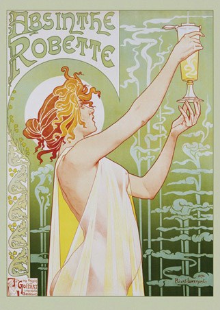
Henri Privat-Livemont - advert for absinthe 


Chris Bayley - editorial for article on the band Rokysopp


Unknown artist - war propaganda


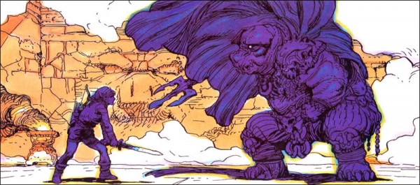
Katsuya Terada - promo art for the video game "The Legend of Zelda: A Link to the Past"

Audience: These pieces of work have a specific audience in mind


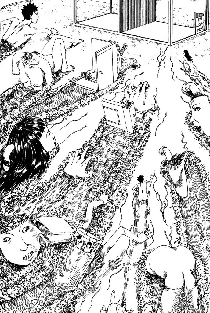
Shintaro Kago - Mature manga artist


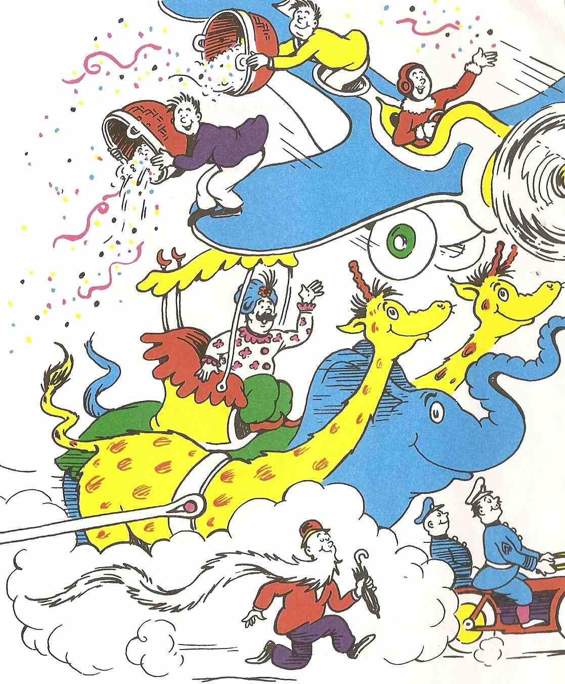
Dr Seuss - Children's book writer/illustrator


Mai 68 poster - Calling to students to protest


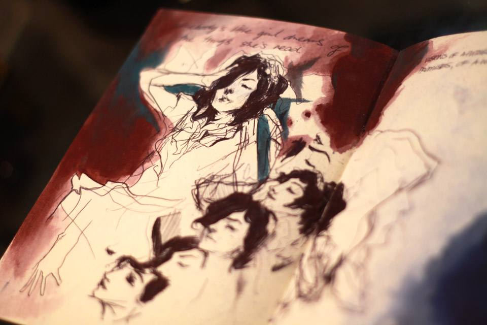
Mikkel Sommer - "Obsolete"aimed at a mature audience


Norman Lindsay - cover of "Oz" magazine no. 33 aimed at the counter culture subculture of 1960s

Process: The processes behind these illustrations/illustrators interest me and/or is a way that I work/would like to work.


Alex Rodriguez - Scanned in pencil drawing and adjusted to create really strong lines before colouring digitally


Nicolas Delort - Using both ink and scratchboard to create finely detailed line drawings.


Ryan Tippery - lightly pencilled sketch with fineliner over it. This is pretty much how I work most of the time


Ian Francis - messy painting with fineliner and pen over the top to define figures


Yoji Shinkawa - Brush pen with digital colouring

Aesthetic: These illustrations/illustrators have visual aesthetics that appeal/inspire me


Henri de Toulouse-Lautrec: I love the simple line work of Lautrec's work and soft colours. His posters have a very fluid and loose feel to them


Jules Cheret - Cheret's work has a similar quality to them, though his lines are more angular. This doesn't detract from the fluidity of the image however.


J.C. Leyendecker - I think Leyendecker's work is just as worthy of epitomizing early 20th century illustration as Rockwell. Leyendecker's work seems to be a bit more stylized which I really like.


Haydn Symons - I think Symons' use of colour here is great and harmonious, and its application has given it a very matte finish which I assume was achieved with gouache.


Ryan Humphrey - Humphrey's work is loose and somewhat naive, but what I find great is the amount of control and deliberation behind each pencil stroke in regards to subtle changes in tone

Julian Landini - Controlled pen work with every stroke being deliberate as with Humphrey. There's no real "scribbling"

Context: These illustrations work specifically due to their context


Sam Nielson - Commercial editorial illustration. I think this has a very toon-like style to it that is sometimes seen in concept art for animations. I feel that the style is very accessible to all ages.


Anonymous poster online - Standalone illustration (as far as I'm aware). I think this image makes good use of frame and composition to enhance the image and action.


Peter Hoffman - sketches to promote a duty-free store in airports in Spanish airports. I feel like these sketches are very dynamic despite the cleanliness of the line work- perhaps due to the extreme angles and tilted view


William Wallace Denslow - Book illustration for The Wizard of Oz. Denslow's varied mark making is used to good effect to define all the different surfaces in the image and describe all the materials in the image.


Paula Bonet - This wall illustration is nice because of how it is drawn with the same looseness as a smaller scale sketch such as the messy yet intricately shaded leaves


Sunday 17 November 2013

OUIL 403 End of module self evaluation

I think a key skill that I have developed throughout this module, and particularly this latest brief, is the ability to persevere with a single idea, developing it, and making it the best idea I can before executing the final resolution. I think this perseverance shows through the experimentation I did in Studio Brief 4 in which I progressed through several ideas and tests before going ahead with my final three illustrations. Though I may not have produced my best work by the end of the brief, the whole process to get there was a valuable experience, and I feel as though each brief I’ve been set has been a similar story.

The varied nature of the briefs has given me an opportunity to try out a fairly wide range of media. This experimentation has led to me becoming more considerate of the scale/aesthetic of my developed work in relation to media. With the exception of studio brief 3, each of my final resolutions has been made using a process or method which I do not usually work in.  Therefore in terms of experimentation, I find studio brief 3 to be the weakest, as I fell back on using pen and a gouache wash, since I didn’t have time to be more adventurous due to my initial struggle with the brief.

I think my development work and use of sketchbook throughout the module has been strong. This is supported by the feedback that I have been getting from peer and tutor reviews. I think the ideas that I come up with for each brief are varied, allowing me to be selective in regards to what I develop into a finished piece. However it was noted that the amount of development work I did for each brief was inconsistent, which I need to address in future. I think the development I did for studio brief 4 was the strongest and most adventurous “journey”, and is definitely what I need to be doing more of.


In the initial brief, we were asked to produce two sheets of 64 thumbnail ideas. While I was not a stranger to thumb nailing quick ideas on a sheet, I had never done it in such a large quantity. I feel that the exercise was useful for that project, but was not a method of working in I particularly enjoyed; I appreciate the skill it tried to develop, but I felt as though I was putting down ideas just for the sake of it. In future, I would like to get better at being able to throw out quick, rough ideas so that I can give myself even more ideas to work with. I feel as though sometimes I am too precious with ideas. I also would like to give myself more time to work on my final outcomes, which would naturally make them look better. These two points are related; if I can achieve the first the second will come naturally. I would also like to give myself more time to experiment with materials/stock so that I don’t go working into my final resolution blindly.

Tuesday 5 November 2013

http://www.georgebutler.org/

I really adore the work of George Butler. A lot of it is reportage and i think he captures the scenery around him excellently. I think what I like most about his work is the sensitive and selective use of watercolour to accent certain parts of the image.


http://johnisaacs.net/works_2009/works_selected_2009_13.html
John Isaacs is a scluptor primarily, but I thought this drawing was cool and worth making a note of

T.W. Rolleston


I'm really interested in vintage illustration, and I find the work of T.W Rolleston to embody it quite well - the intricate linework is something that I admire particularly as I try to use pen in a similar vein in my own drawings.

Tuesday 29 October 2013

Ben Shahn

http://todaysinspiration.blogspot.co.uk/2011/06/ben-shahn-most-influential-illustrator.html


Interesting article on the influence of Ben Shahn's work in the latter half of 20th century illustration. The article takes a point of view that talks about the explosion of naive illustration these days, even going as far as to call it "bad drawing". I have to admit that I agree with the blog author's "disappointment" at how many illustrators seem to take on this approach these days. However, while it is certainly removed from the sort of illustration I am interested in making and seeing, I can appreciate the qualities when it is done well.

I personally believe good drawing/illustration is deeply rooted in a sound understanding of basic fundamentals; you have to "know the rules in order to break them". Picasso is probably an excellent example of someone who knew the rules and broke them because he could, and could do it well. The blog post implies that because Ben Shahn got famous with this naive approach, others saw it as an excuse to not train themselves in the fundamentals of good drawing.
I'm sure many of today's illustrators do have a solid understanding of drawing fundamentals; we just don't get to see it that often which I find to be a shame because of the seemingly over saturated market of naive illustration.

It's interesting to see exactly why so many illustrators suddenly took this approach to illustrating and where its origins began. Ben Shahn was a contemporary of Norman Rockwell.

Monday 28 October 2013

5 Categories of illustration

Concept Art: These pieces of illustration exemplify the category of concept art in illustration. I feel each of them are visually interesting and they great ideas/concepts that have been key in the final formation of the concept, whatever form it took.


Yoji Shinkawa for the video game "Metal Gear Solid"


Clover Studio for the game "Okami"


Ralph McQuarrie for the original Star Wars trilogy


 Various Pixar artists for the "Toy Story Sketchbook"


Takayosi Sato for the game "Silent Hill 2"
http://trazobit.wordpress.com/2012/06/02/silent-hill-concept-art-de-takayosi-sato-y-masahiro-ito/


Skill / Complexity / Detail: Each of these illustrations show one or more of these traits. Kim Jung Gi's show all of these traits. These traits can be from the level of detail present in the work, the technical skill in drawing/painting or the complexity of an idea.


Kim Jung Gi

"Freedom From Want" by Norman Rockwell
Published on March 6th 1943 in the Saturday Evening Post


J.C. Leyendecker
http://lofty-genius.blogspot.co.uk/2010/09/j-c-leyendecker-part-1.html


Nimit Malavia


Gustave Dore for "Rime of the Ancient Mariner"


Use of Media: Each of these illustrations use different types of media which are crucial to the effect/impact that the final illustration has. i.e Eric Olson's use of oil paint is what helps give his planet the texture that creates a sense of depth and surface.


Max Zorn- packing tape


Mark Khaisman- packing tape on plexiglass. Used to a different effect to Zorn, more blocky shapes.


Erik Olson- oil paint


Jeff Nishinaka - Paper


Caroline Hwang - drawing/sewing

Conceptual Development: These illustrations show great conceptual development, primarily in the form of good/interesting sketchbook keeping.


Alphonse Mucha - Study/preliminary sketch for Four Seasons


James Jean - sketchbook work


Nimit Malavia - sketchbook


Chris Ware - sketchbook


Warwick Johnson Cadwell - sketchbook at Latitude


Narrative: These illustrations have a narrative quality to them, whether it be because they are sequential images as part of a comic or strip, or because they tell a story within the image.


Moebius 


Milo Manara - History of humanity (portion)


Hitoshi Ashinano - Record of a Yokohama Shopping Trip


W. W. Denslow - The Wonderful Wizard of Oz


Nicolas Delort - A Rumour of Angels